Square Feet Mantra
REAL ESTATE
EXPERTISE: LOGO DESIGN, BRAND STRATEGY, BRAND IDENTITY, BRAND ASSETS, COPY WRITING, BRAND GUIDELINES
In the bustling city of Navi Mumbai, where people come with high hopes and dreams yet struggle with places to live, Square Feet Mantra wanted to be the guiding hand that can make the complex world of real estate accessible and reassuring for everyone.
With a focus on transparency, empathy, and professionalism, SFM is committed to helping clients turn their property dreams into reality.
They wanted an identity that would help them create lasting relationships with their clients by being a little relatable and comfortable.

The SFM logo is a combination mark. It consists of two elements; the icon and the word mark. Inspired by the shape of a house and a spark of Mantra, SFM logo creates an illusion of a square creating a confined yet open and comfortable atmosphere.

Brand Personality
Supportive, Organized, Helpful, Friendly
Tone of Voice
Empathetic, Reassuring, Real, Honest
As the identity had to be something friendly and relatable, we did not want the brand name or even a single letter to become dominating, hence avoided writing the brand name in all caps, title case or sentence case.

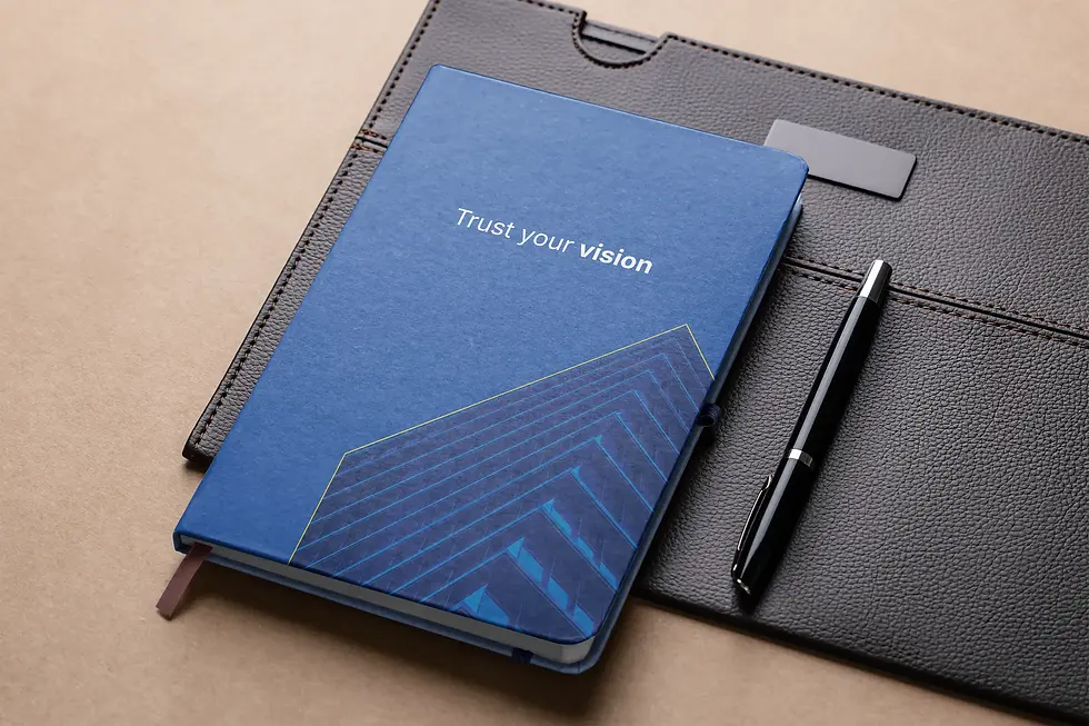
Not just the logo was well thought out, but the color palette is also made to feel trusted and comfortable, with a touch of yellow to make the customers feel energized and happy about buying/ renting a new place.
Every icon created is visually harmonious, balancing the brand's friendly nature and the bright expertise they offer throughout the process.


Every background element was very thoughtfully designed, with 1 set of typographic lines to make the business more stand out as a real estate brand and the other direction was more inclined towards adding real life imagery of the building with a touch of SFM guidelines to make it more suitable to the brand vision.
We divided the images into multiple sets, where each country had 5 image buckets and each illustration was well put together based on experiences, brand values and the solutions the brand offers.
The complete icon set was scalable and legible, and the color palette was more inclined towards creating a minimal and growth oriented brand with an accent color of yellow to maximise the impact of the CTAs.

The brand visuals were designed to match all the guidelines created with inspirations taken not just from scrabble but from lines and the board of the game itself.

The brand is incomplete without proper messaging. Keeping this in mind, for every platform, we created a brand messaging that would not just be direct, reassuring but also without any false claims. We thought of playing around vulnerability and relatability of the audience with a usage of both English and Hindi language to increase relatability at places.


Click here to view the complete Brand Book of Square Feet Mantra
Click here to study the full process
How did we stand out?
"The Yellow Outline worked on building the brand identity for our startup, and her work exceeded all expectations. They designed and strategised our brand, all of which aligned wonderfully with the brand’s tone and message and seamlessly balanced creativity and practicality-created designs.
Communication was smooth throughout the process, and the team was always open to feedback, making adjustments until we were fully satisfied. They also made sure to give suggestions and ideas at each step and delivered everything on time and as per the schedule shared before starting the project."
- Srushti Pasalkar, Partner and Design Head @ SFM
