

Midautumn Rains
CLOTHING | FASHION
EXPERTISE: LOGO DESIGN, BRAND STRATEGY, BRAND IDENTITY, BRAND ASSETS, COPY WRITING, BRAND GUIDELINES
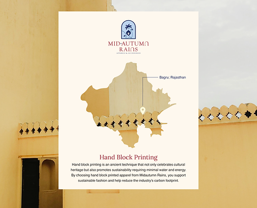
Midautumn Rains is a Goa-Gurgaon based apparel and accessory brand which creates fashion a lot more than just mere designs– they're a fusion of travel-inspired prints and functionality, timeless pieces crafted with their own distinctive patterns. As a lifestyle brand ignited by wanderlust, they wanted a modern identity that would bridge diverse cultures, connecting communities through narratives woven into each creation.
Every product is handmade and unique in its own, and they wanted to inculcate that feeling in their identity as well. They wanted something that would link back to their cultural heritage, transforming into a timeless work of art.

As this project was a brand revamp, the team very much wanted to not only create a better identity but also wanted to take inspiration from their story till then, their products and their journey.
Goa was the place where the idea of MAR originated, hence how could we miss that small detail of their journey! The major part of the logo is inspired from the travel stories of Goa and the cultures of Gurgaon with multiple hidden elements throughout the logo.

Monuments of Delhi

Landscape of Goa

First print of MAR
Word mark
As all the products are meticulously handcrafted by skilled artisans, the handmade nature of the items stay, with slight variations in weave, print, or stitching. We wanted to include that treatment in the wordmark, hence we chose a font that would be a testament to the individuality, and imperfection.

Payal, the founder, wanted to keep the color palette similar to the old identity, hence we stuck to the red color but slightly changed the shade to match the new values. To compliment that, we added a few more primary and secondary colors and not just the logo but the whole brand identity, including the icons, was heavily inspired from the Indian heritage, paintings, and the history.


The brand fonts were chosen in a way that would not just showcase heritage and history but would also show timelessness and modern take of the brand.
The project did not just stop at the brand identity, but the team made sure that every strategy chosen and every design created was implemented well on their ecom website with a touch of cultural inspiration and a modern take in the brand messaging.

How did we stand out?
"It has been a pleasure working with Yellow Outline for our creative strategy. From the very start, they took the time to deeply understand the creative needs and vision of our brand which allowed them to completely transform our brand presence. Their approach to revamping our logo was spot-on, delivering a premium look that aligned perfectly with our brief and exceeded our expectations. The thought process behind every decision was seamless, and the final result resonates strongly with our customers, who have been very appreciative of the new design of the logo as well as the website. I highly recommend Yellow Outline to anyone looking for an agency that truly understands brand strategy and creative execution. I’m excited about the possibility of a long-term partnership with them"
- Payal, Founder @ Midautumn Rains